Google is releasing a new tool for visually displaying website performance and areas for improvement. The tool’s resounding name is CrUX Vis, which stands for Chrome User Interface Visualization. The dataset consists of user data from the Chrome browser, and it compares website performance against the Web Vitals programme’s measuring stick.
The disadvantage of the new service is that it is far from exhaustive, as it doesn’t measure every website (yet). Sites must meet certain conditions, such as being publicly accessible (and accessible to Google’s robots) and having a sufficient number of visitors, although it is unclear how many they must have.
Those are rather general conditions, and a quick test via cruxvis.withgoogle.com makes it clear that data from many sites is not yet available. Large general news sites are usually already in there, as are public sites. To be clear, all data is publicly accessible to everyone.
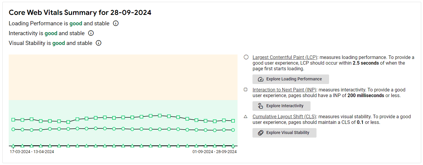
CrUX Vis shows several important things that Google has listed in its own Web Vitals programme, which measures the ‘health’ of websites. One example is visual stability (via the Cumulative Layout Shift or CLS metric). In this case, a site scores worse as visual bells and whistles cause unusual behavior, jump around, or cause other issues that make navigation difficult.
Visualizing existing metrics
Other metrics include Interaction to Next Paint (INP) and Largest Contentful Paint (LCP). The former measures the degree of interactivity based on the time between one interactive action and the next; the latter measures loading times. Users can display this and other data in an overall view, or focus on individual metrics.
The metrics used are nothing new in themselves, and website developers, SEO specialists and UX experts will know them well. However, this is the first time such data can be visually displayed over time via a free-to-use tool. This makes it possible to see whether a site (or an individual page) becomes more or less performant over time.
Evolution through time
CrUX Vis clearly indicates whether a measured component is performing more or less well compared to previous measurement times, as shown in the example below. Performance may be shown for specific time periods and for individual devices such as desktops, tablets, or phones. All green means a good score; yellow indicates areas for improvement. When the graph goes into pink/red, there is a desperate need for maintenance.
The higher sites score in these and other areas, the better they can be found through Google Search. Also, a good score positively affects clicks, specific conversions, ad revenue and other possible targets.
Google makes it clear that CrUX Vis is still an experiment, one apparently created thanks to the work of a summer intern. Google has a habit of sometimes discarding new products and services as quickly as they came along. So it remains to be seen if CrUX Fish is a keeper or if it will remain a summer experiment.
Also read: Chrome data hunger leads to U.S. lawsuit