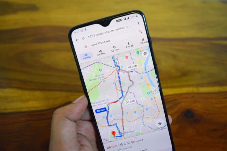
Google announced on Wednesday an update for Google Maps that will show users a new Covid-19 layer. With it, one can have a much clearer understanding of the number of cases in a given area. With the pandemic continuing its fast spread in many countries and a second wave looming on the horizon, this colour-coded map can help users know what to avoid.
The map’s color-coding is based on the number of cases per 100,000 people, with additional labels that indicate whether the trend is going up or down.
The data is available for the 220 countries and territories supported by Google Maps.
Check out the data in your area
Where data is available, one can access the numbers down to the city level. The data comes from various sources, including the New York Times, Wikipedia, and Johns Hopkins. These sources are the same ones used when you search for COVID data on Google’s search.
It is not immediately clear whether Google will bring the desktop Maps version soon.
Users can open up the map and look at the overlay to decide which activities and locations are safe. This way, they can avoid going to high-risk areas or be stricter about personal protective measures if they already live in high-risk areas.
What to do and where to go
The Google Maps overlay is going to be available on both Android and iOS during this week. As Sujoy Banerjee, the Google Maps project manager said in a blog post; the layer would help people make informed decisions about what to do and where to go.
The Centers for Diseases Control and Prevention (CDC) and public health experts recommend that people keep track of the spread level in their area to avoid causing or being caught up in surges.
Everyone benefits if the public practices safety.
