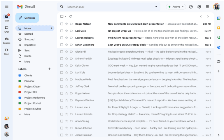
Google announced an overhaul of Gmail’s visual design. The update has been deployed to a select number of users and will be pushed to broader groups over time. When Gmail’s interface turns blue, you’ll know it arrived.
The new Gmail design went into an opt-in preview in February. Now that Google has gathered input and made some adjustments, it’s being made available to everyone.
A few things have changed between this point and the February preview. The all-blue colour scheme is the most noticeable modification. You can revert back to Gmail’s original design in the settings once the update arrives.
Changing settings
Thanks to the theme option, you can alter the colour of Gmail to a shade of choice. Click ‘see all’ in the “theme” section after selecting the settings gear in the upper right corner of the screen to change the colour. The solid ‘soft gray’ option is the one that most closely resembles the original interface. White would be a closer match, but that isn’t an option.
Other changes
A new button (‘my photos’) redirects to your account’s Google Photos collection. Furthermore, the new design includes a second sidebar, which feels like an advertisement for Google’s other communication tools. Thankfully, Google provided the ability to turn off the sidebar between the February preview and the latest release, showing that it listened to user input.