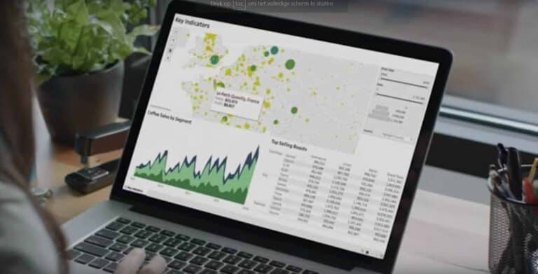
Tableau added a very useful feature to its toolset. Tableau Data Stories adds an automatically generated description of a dashboard, so that anyone viewing the dashboard also understands how to read the data on display.
One of the most common complaints of companies with different dashboards is that it’s not always clear how the data should be interpreted. Especially in larger organizations, where dashboards are built by a select group and shared with a large number of colleagues, there can be questions about how the data should be read.
As a result, many dashboards include accompanying text to explain the data. Writing these texts creates a lot of extra work. Tableau makes things easier. Tableau Data Stories knows exactly which data has been selected, how it has been compiled and which filters have been applied. Based on this information, a description is generated that explains how to read the data.
Tableau Accelerators
In addition to the automatic generation of a good description for dashboards, Tableau made the necessary enhancements to its Tableau Accelerators. These are template dashboards specifically targeted at different industries, departments and enterprise applications. Customers can quickly deploy these dashboards and customize them as needed. It accelerates the adoption of Tableau and helps companies generate insights into specific industries and applications.
Tableau Cloud
Tableau also presented Tableau Cloud, the latest version of Tableau Online. Tableau’s focus has shifted from an on-premises solution to a cloud model in recent years. Although Tableau remains available on-premises, almost 75 percent of customers opt for SaaS, which is something that parent company Salesforce specialises in.
Tip: Tableau wants to make analytics understandable for everyone
