For the twelfth edition of the Tableau Conference (TC19), 20,000 data enthusiasts travelled to Las Vegas in mid-November to emerge themselves in data visualisation for three days. The central message: data makes the world a better place, as long as data tells the story well. NLP and Machine Learning should make that even easier, with the new Tableau functions called Ask Data and Explain Data.
Tableau Software, the Business Intelligence software vendor, now has more than a million users in some 65 countries. Among their customers are well-known names such as British Airways, Citrix, LinkedIn, Sisheido and Verizon. Tableau collaborates with AWS, Google Cloud, Microsoft Azure and Alibaba Cloud, and for an acquisition price of $15.7 billion, they are part of the Salesforce family since this summer.
Equality
What was striking for us at the Tableau Conference was the attention paid to social issues and emancipation. A lot of diversity in the use of images around the conference, a lot of diversity also on stage. In the keynote of Tableau President and CEO Adam Selipsky he also specifically brought attention to data-skilled women in history. To illustrate the contemporary importance of ‘data literacy’ or data skills, he drew a parallel with the Second World War. Secret writing and coded messages were an important part of warfare. Cryptography reached new heights, and the US did not have enough codebreakers and cryptanalysts. “What the U.S. needed was a data culture,” says Selipsky.
The government started recruiting bachelor students at universities who liked to solve puzzles, but half of the 19- to 29-year-old men were shipped to war zones. The government then decided to focus on women and moved the recruitment campaign to PABOs. That whole story is described in the book Code Girls by Liza Mundy, a speaker on TC19.
Data culture and best practices
The point is that a new wave of employees offered themselves, all of whom had to learn new skills. In four years, the number of codebreakers shot up from a few hundred specialists to twenty thousand trained professionals. “Not everyone had to work at the top level,” Selipsky explained. “The U.S. needed a lot of people, with data skills at different levels.” Nor did everyone need access to all the data, only those needed to do their job properly.
This short story about setting up a data culture formed a handy bridge to the introduction of Tableau Blueprint. This is a methodology for setting up a data culture within one’s own organisation, using Tableau.
Salary gaps and other values
Then Marc Benioff entered the stage, the founder and co-CEO of Salesforce, for a cheerful one-two with Selipsky. Many visitors praised the spontaneity of the conversation and the lack of commercial talk. Others were surprised by the nonchalance with which Benioff – with beard and hat – was chatting, while sitting in his chair.
The tone was more serious when Selipsky asked what made Benioff catch his eye on Tableau at the time. He said: “Few companies are that similar to Salesforce in customers, culture and values”. He praised Selipsky’s opening story “which emphasised emancipation because equal rights is a core value for us. It starts with equal pay for men and women.” It cost Salesforce ten million dollars to close the pay gap in their own company, but they’re not finished yet. “When you buy a company, you buy their paychecks. That makes them our pay scales, so we have to make sure they’re the same for men and women in equal work.”
Ultimately, values are more important than technology, Bernioff stated. With a wide arm he waved to the public: “If the technology disappears in ten years’ time, the core values will still exist. Just like the energy in the room.” I’m sure he didn’t mean that Tableau will no longer exist as such in ten years’ time, given the cheers of the public. About the future, Benioff said: “Salesforce is about customers. You’re about analytics. We have Customer 360, you have data. And we love data.” Selipsky: “And we share your passion for the customer.”
New Tableau Features
In the past year, Tableau’s functionality has been expanded with 200 new features. One of the add-ons is Catalog. This is an index of meta-information that shows users the source of data where data is used within the company, by whom and in which process. The idea is that more insight leads to better data management. But also that data that is used by more people would be more reliable. Because it is visible who works with what, all relevant users can easily be informed in case of problems. If, for example, the same laptop keeps popping up as a source of dubious reporting, targeted action can be taken.
Ask Data
Two other features in the spotlight were Ask Data and Explain Data. Ask Data uses Natural Language Processing (NLP) to provide users with normal language analysis. The user does not need to know any formulas, but can, for example, arrange data using the command ‘how much in June and July’. In the illustrations Superstore and Sales Performance, you can see that normal language is used instead of formulas. A form of autocorrect complements the most commonly used terms, such as ‘sort’, ‘in ascending order’, or ‘average’. The results of the searches are immediately visible in the visualisation.
Explain Data
Explain Data analyses the outcome of the visual analysis based on underlying models. If a visualisation shows strange phenomena – think outliers and exceptions – the user clicks on Explain Data. The software then calculates possible causes and selects the most likely ones, based on the relationships between the data used. See the ‘bike-trio’ illustrations. “Statistical analytics for everyone, in seconds,” said speaker Samantha Kwok, senior manager engineering.
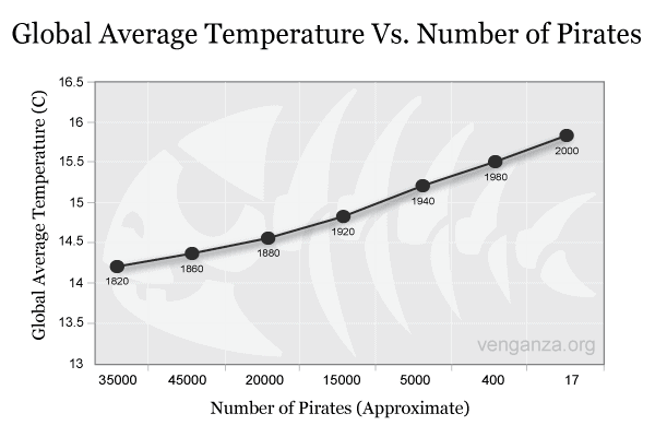
There’s a risk in all that ease of use. Users who don’t understand the basics of data analysis can just keep clicking until they find an outcome they like. Mark Jewett, Tableau’s VP of Marketing, said in an interview about data culture that it’s important that people have some data skills. “That they know the difference between correlation and causality: sometimes there’s a connection between two things without the one causing the other. Take the graph below, which shows the decrease in the number of pirates over the past 180 years and the rise in the average temperature worldwide. However, this is not a causal relationship: one is not the cause of the other.

Iron Viz
Tableau offers business software but can also count on a community of fanatical users. This became very clear during Iron Viz, a live competition in data visualisation. After a year of preliminaries by thousands of participants, three finalists compete for the title, under the cheers of thousands. In practice, therefore, three people behind a keyboard and screen, which like a frantic click and drag, while two presenters comment live. Seeing is believing.
Jewett says about the community: “Our software was the basis, the beginning. People loved data, and they loved using Tableau. A world opened up to them, and they wanted to tell others about it and help them do their job better. All we do now is facilitate our community through an infrastructure of forums, ambassadors and user groups. It is the passion and energy of the people themselves that keep the community going. And Iron Viz is a remarkable example of that.”
