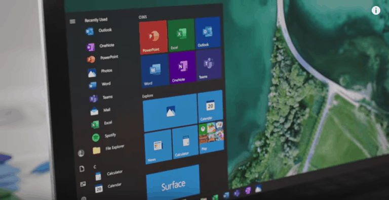
The new design language that Microsoft is about to introduce for the Office icons will eventually be rolled out to Windows 10 and other products as well. This was announced by Office design boss Jon Friedman on the fringe of the unveiling of the new Office icons.
It is a huge undertaking to build a common system and at the same time design ten pictograms. Now that we have set up the system, we will scale it throughout Microsoft, Friedman responds to the question whether new icons will also be designed for Visio and other Office apps.
However, Microsoft does not stop at Office alone. This is the beginning of a collaboration across the company to renew all icons in the same style, it sounds in a second reaction. If you look closely at the images in Friedman’s blog post, you already get a foretaste of the direction in which Microsoft wants to go with the icons for some standard Windows 10 apps such as Photos, Calendar and Calculator. According to information from The Verge, these are still mock-ups for the time being, but Microsoft is planning to effectively modernise the icons over time.
Windows 10 still contains some icons that are more than ten years old and don’t feel completely at home in the modern operating system. Now that Microsoft plans to implement the same icon style throughout the company, it may finally succeed in replacing the outdated icons with a more consistent design.
This news article was automatically translated from Dutch to give Techzine.eu a head start. All news articles after September 1, 2019 are written in native English and NOT translated. All our background stories are written in native English as well. For more information read our launch article.